
.svg)
.svg)
COPRO wins the Red Dot Award 2019
November 1, 2019
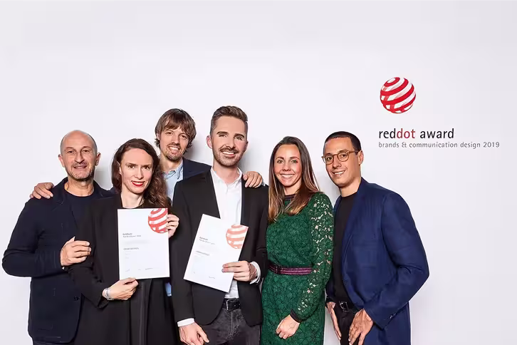
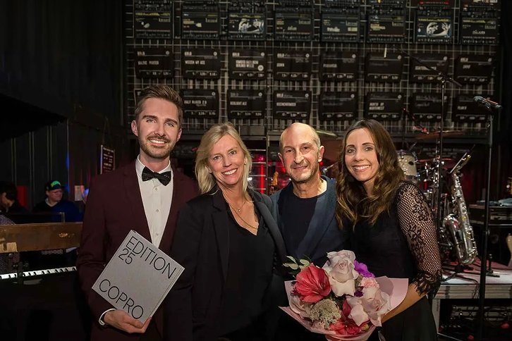
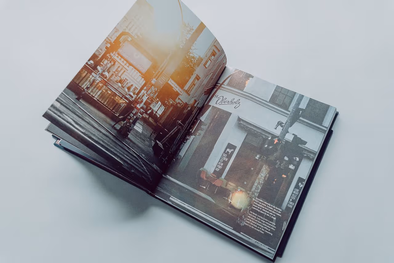
Berlin, November 5, 2019 – EDITION25 showcases COPRO’s projects and achievements since the company was founded in 1993. The book project was initiated by the management, who also played a key role in shaping the content. The holistic concept was developed by the COPRO team together with specialists from the fields of art, architecture, and culture. The design – created in collaboration with the Berlin agency Cee Cee Creative – won over the international panel of experts: the project received the Red Dot Award, the renowned seal of quality for outstanding design and creativity, in the Brands & Communication Design 2019 category. Back in June 2019, the publication had already won the ADC Award for Corporate Publishing from the Art Directors Club Germany.
Marc F. Kimmich, CEO and founder of COPRO, explains:
“The awards for our anniversary publication demonstrate the great importance that the interplay of architecture, art, and culture has had at COPRO for more than 25 years. With EDITION25 we were able to present these aspects not only side by side, but in dialogue. We are proud that our commitment and bold ideas of the last 25 years – bundled into a single book – have now been honored with a highly respected international prize. My personal thanks go to everyone who contributed to this extraordinary project!”
A book as a bridge between past and future
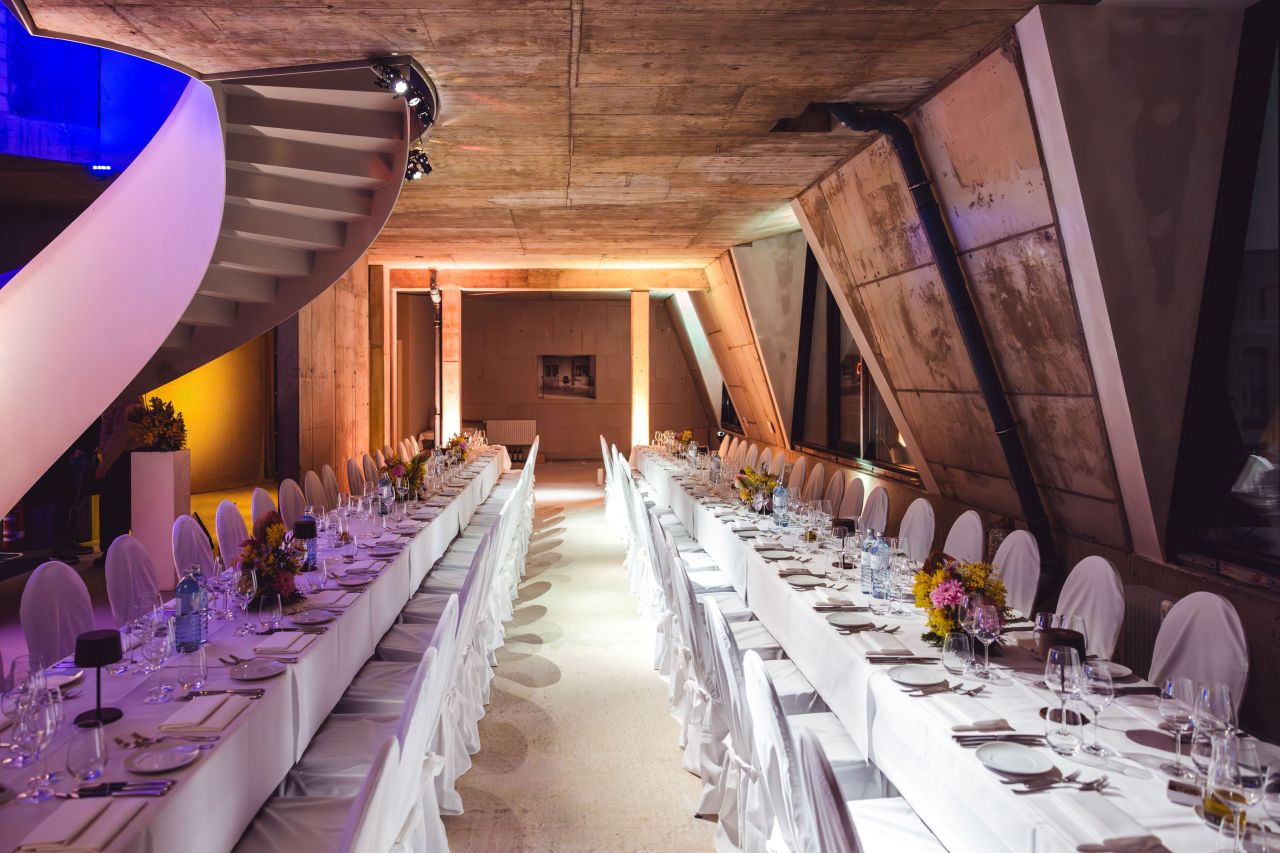
The anniversary book invites readers to look back together and to look ahead. It offers intriguing insights through interviews with experts, employees, and family members, as well as carefully selected images of exceptional real estate projects in Stuttgart and Berlin set in an artistic and architectural context. At the end of the book, COPRO presents its forward-looking project in the heart of Berlin: Urbane Mitte Am Gleisdreieck.
The project’s DNA can already be felt in B-Part Am Gleisdreieck – an experimental laboratory for developing the urban neighborhoods of tomorrow, currently operating as an interim use on the site.
Bound in silver linen, the anniversary book comprises 288 pages in a square 25 × 25 cm format – a homage to both the 25th anniversary and the square form of the COPRO logo. The embossed title lends the publication a particularly high-quality appearance. Printed on the cover in neon orange are all business years from 1993 to 2018 – a color underscoring the significance of each individual year for the company’s development.
Neon orange also serves as a visual guide throughout the book and stands for warmth, courage, dynamism, and the company’s ongoing commitment to art, society, and urban spaces. In contrast, the corporate color metallic blue symbolizes the tradition and authenticity of historic buildings. The two colors come together in the book’s foreword in the city maps of Stuttgart and Berlin, the two focal points of COPRO’s activities. A neon-orange bookmark with an integrated timeline guides readers through the company’s 25-year history.
Red Dot Award 2019 presented to COPRO
The Red Dot Design Award was established more than 60 years ago by the German Design Council. Agencies, designers, and companies from around the world can submit their work in 17 categories. This year saw numerous international participants, with more than 8,600 entries evaluated for aesthetics, originality, clarity, and execution. EDITION25 is also featured in the international Yearbook Brands & Communication Design 2019/2020 of the Red Dot Awards.
News & Press
.avif)
.avif)

.avif)
.avif)

.avif)
.avif)


.avif)

.avif)
.avif)
.avif)
.avif)
.avif)


.avif)
.avif)
.avif)


.avif)

.avif)
.avif)
.avif)
.avif)


.avif)


.avif)

.avif)
.avif)
.avif)
.avif)

.avif)
.avif)
.avif)
.avif)
.avif)
.avif)

.avif)

.avif)
.avif)
.avif)

.avif)

.avif)
.avif)

.avif)